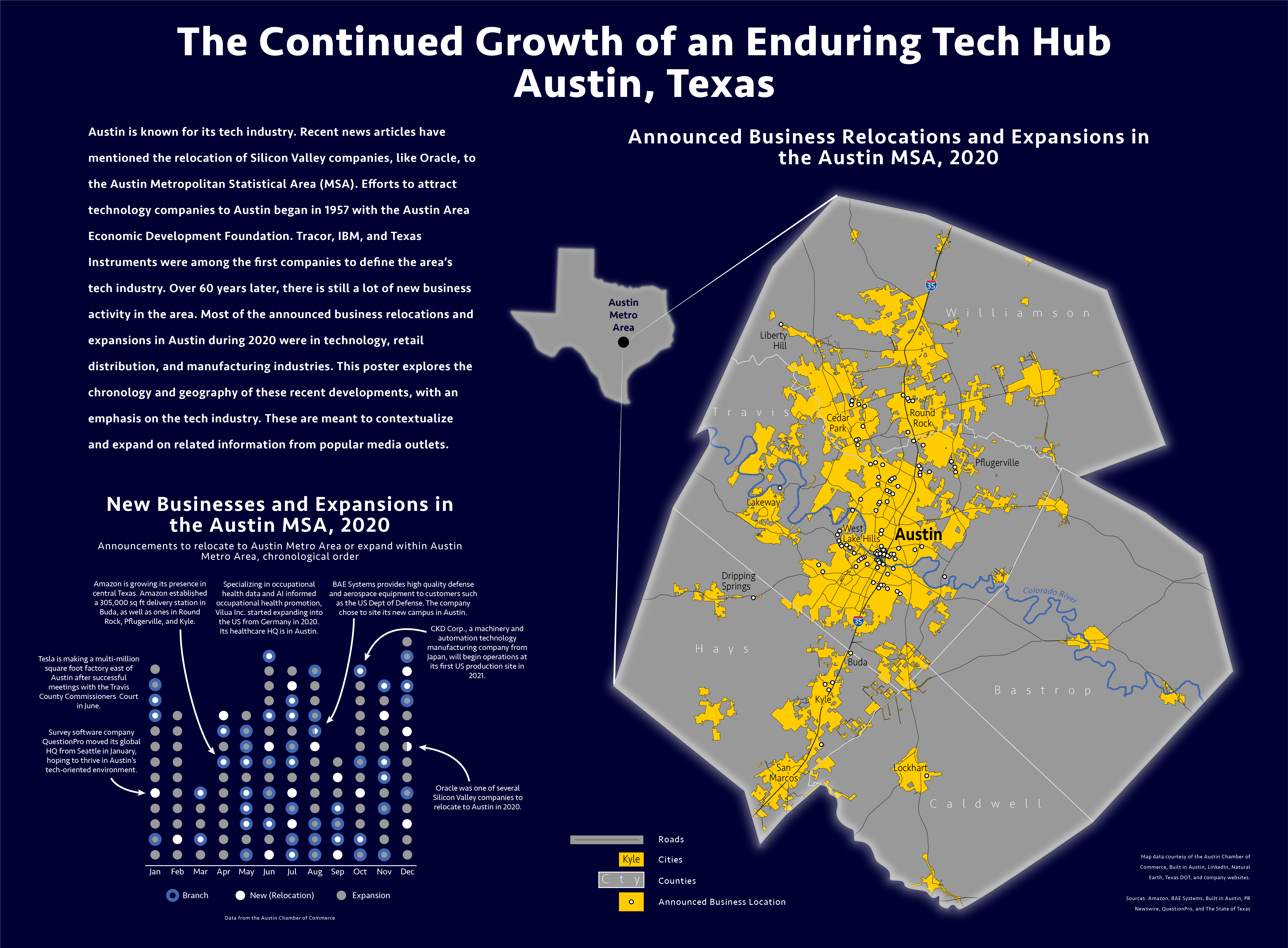
I made this poster in January 2021 and submitted it to the Wisconsin Land Information Association (WLIA) for their annual map contest.
Background
After drafting some ideas on paper, I made this map using QGIS and Adobe Illustrator. This map has larger dimensions because it is supposed to be an informative poster. The WLIA
Idea
When I was reading news articles about the exodus of Silicon Valley companies, I immediately recognized that there was a geographical story to tell.
At first, I wanted to explain why Silicon Valley was declining relative to places like Texas and Florida. Austin and Miami seemed to be the epicenters of the current technology boom. However, an opinion piece by Margaret O'Mara made me rethink the efficacy of such a map. The map I was originally going to make might have incorrectly portrayed Silicon Valley as a desolate place. In reality, Silicon Valley is still an economic powerhouse.
I decided to research the places where the tech companies were going to. I was already drawn toward Austin, knowing that at the end of 2020, Austin was on track to becoming the next US city to surpass a population of one million. What I saw in Austin was a legacy of technological enterprise spanning multiple generations. Once I found the convenient and apparently comprehensive company data on the Austin Chamber of Commerce website, I knew that my map would be about Austin.
The Austin Chamber of Commerce recorded the businesses that relocated to or expanded in the Austin Metropolitan Statistical Area (MSA). The data included the names of the companies, descriptions of the companies' goods and services, the month of the announced expansion and/or relocation, and the municipality where the expansion and/or relocation took place.
Graph
I knew that I wanted to make a map showing the spatiality of Austin's business growth. I made a graph first, though. In December 2020, when I decided to make a map about Austin and its flourishing businesses, I read a 2020 National Geographic magazine with an article about the challenges facing the Great Lakes. In the middle of the article was a graphic about invasive species in the Great Lakes. There were illustrations of animals like sea lampreys and Pacific Salmon. There was also a timeline with dots stacked over it. Each dot represented an invasive species and the year that the dot was over corresponded with the year that the invasive species was first detected in the Great Lakes. The timeline also highlighted key invasive species using annotations.
That inspired me to make a timeline of the business expansions and relocations in the Austin MSA. Since the Chamber of Commerce categorized expansions and relocations by month, I incremented the timeline by month. The dots' fill colors symbolized whether the company expanded and/or relocated. Their strokes symbolized whether the location was a branch or a headquarter.
Despite showing all of the companies, I wanted to focus on the technology industry since that would be most relevant to a general audience. So, I followed the example of the National Geographic timeline and visually accented several businesses of interest. To do this, I picked a handful of tech companies and provided annotations about them. Annotations make graphs more salient, and they help readers connect individual data points to the overall message.
Map
I made a basemap of the Austin MSA on QGIS with DOT data. My plan was to map out the location of each business expansion and/or relocation. However, the Chamber of Commerce only provided the municipality of each company expansion and/or relocation, not the address. So I looked through several websites to find as many addresses as I could. This allowed me to plot businesses on the map as point features.
I didn't annotate the map as I did with the graph. I wanted the map to be more holistic by displaying all of the companies without overemphasizing or undermining certain industries.
Design
The poster is supposed to have a style that reminds people of tech companies. This stylization was not meant to be too overwhelming. I felt that the dark background, the heavy use of blue, and the sans-serif typeface all evoked a sense of modernity.
I usually try to make an accommodating color palette, and in this case I did not add any red or green hues. I saved yellow for the map so that it could stand out against the dark blue background. I also created a slight fog-of-war effect on the map margins. This bounded the extent of the map while reminding the reader that the Austin MSA is part of a larger geography. The relative sizes of the explanatory text, graph, and map were supposed to make the poster as balanced as possible.
