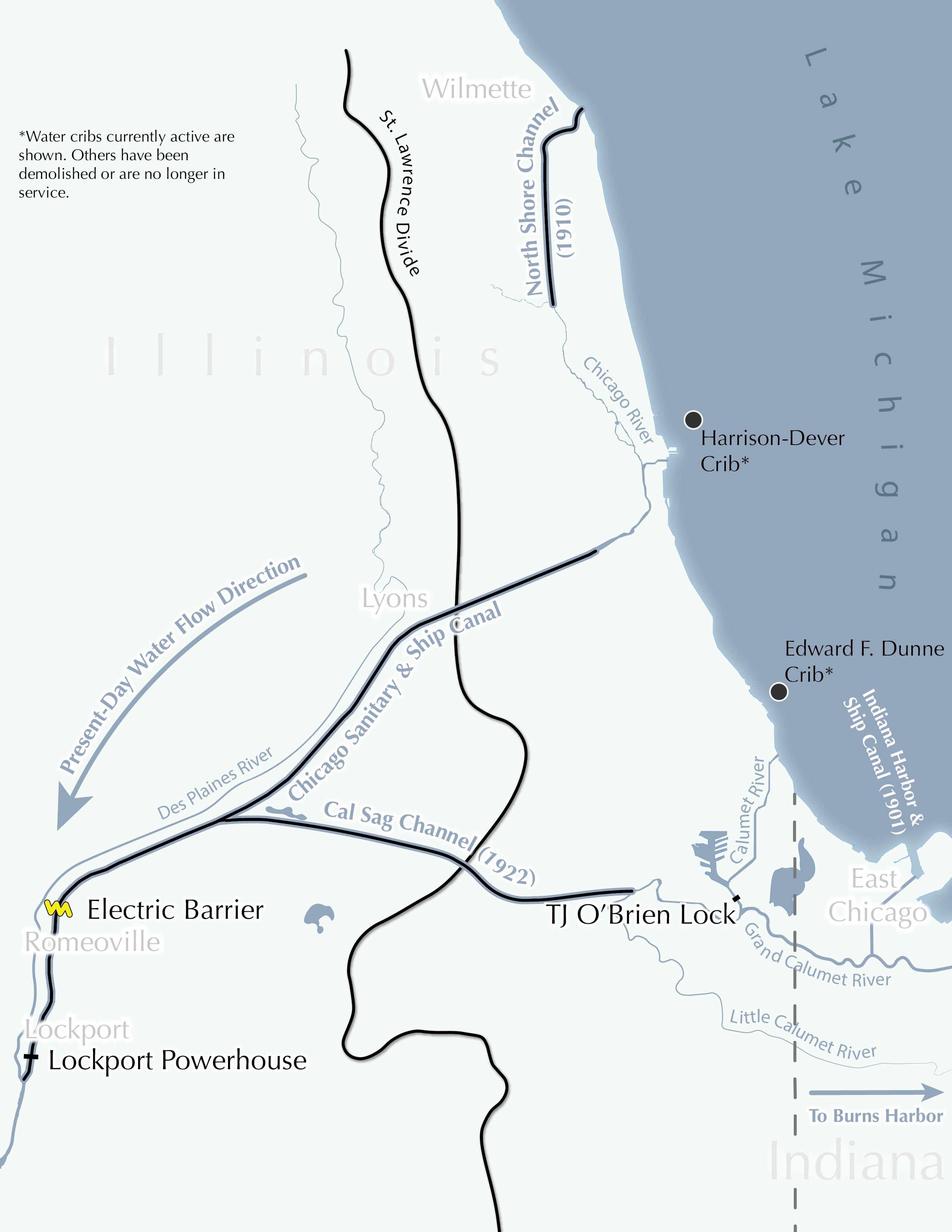
This map is a slight revision of my final project for the Graphic Design in Cartography course at UW-Madison. Robert Roth taught the course when I took it in Fall 2019. This advanced cartography course exposed students to narrative construction, shaded relief mapping, hyperrealist design, and longform infographics. Also, in contrast to the introductory course, this course emphasized the cognitive aspects of map reading such as emotion, biases, syntactics, and semiotics.
Background
For the final project, students had a large amount of freedom with regard to content and design so long as the labor involved was appropriate and the end product incorporated class concepts. Students were expected to be original, clearly establish a voice, and create a mood within their projects. I felt most comfortable creating a longform infographic about a topic I was somewhat familiar with already. I spent most of my life within a few miles of the Chicago Portage Site, which greatly influenced the history of the whole metropolitan area and even the country. Albeit, many of the events connected to the portage are controversial, and others are not directly connected to life in the city today. However, I wanted to tell the story of Chicago’s canals in a chronological narrative arc. The main plot points I included in the infographic addressed some of the problems with the area’s developments. Other plot points connected the past to the present to show how the area’s canals are important today, as indicated in the subtitle.
Narrative
My goal was to familiarize a reader from the Chicago Metro Area with a case for why canals have been important for the city, whether for good or bad. Adopting a primarily objective yet unassuming voice, I followed a basic chronological narrative to simplify the storytelling process. I considered starting this chronology with some geological history to preface the current regional surface water hydrology. I decided to start with the geography of the indigenous peoples of the region west of the Great Lakes.
The canals, being human developments, made an exposition lefted on people more appropriate than one devoid of people. Acknowledging indigenous people is important in this context as the infographic covers an area that they have been living in for thousands of years. Moreover, the indigenous peoples were the first ones to traverse the region’s portages. As mentioned in the infographic, some of them introduced explorers to the portages.
Each plot point in the infographic consisted of a map and some corresponding text. My workflow for creating these maps and texts started by deciding what I wanted for my longform from preexisting maps and articles. Next, I decided what I needed to add. This process also required filling in common gaps in the articles’ historical accounts and resolving contradictions or ambiguous statements within them and between them. In the end, the story explained the hydrology, European exploration, urbanization, transportation infrastructure, and the aftereffects that I saw as relevant to a cursory understanding of Chicago’s canals.
Data Sources
Much of the text originated from facts presented in Illinois based sources such as the Chicago Tribune, the Illinois DNR, and especially the website for the I & M Canal Corridor Association. Regional sources also provided the inspirations for the infographic’s maps, such as the Illinois drainage basin map found on the University of Illinois website.
Design Process
One of the greatest challenges of this project was establishing a consistent style for the maps that would complement the text. The infographic addressed different kinds of phenomena at various scales, which created the biggest challenge to consistency. It was difficult to maintain label consistency as some maps were more sparsely populated with them than others, and some labels did not work as well against the water as they did against the land.
Making a map of the region’s indigenous peoples was a unique issue. I mainly wanted to show the main groups of people who inhabited the area before the arrival of Europeans. My styling for the project was not well suited for a humanizing map as most of the maps exhibited a practical and straightforward appearance. I tried to make up for this in the text and conclusion, but I’m not satisfied. An indigenous cartographer named Aaron Capella made a map of this very thing, which was the basis for the first map in the infographic. That relieved me of some responsibilities like relative label placement and proper demonyms.
I followed most typographic, label placement, and coloring conventions to facilitate general reading of the maps. I relied heavily on halos and fuzziness to soften the compartmentalization. I used shadows to suggest a vertical axis for recognizable superimposition. Each event featured a thematic partition depicting a boat and lock in a waterway. The conclusion featured pictures of the Chicago Portage National Historic Site. These were supposed to corroborate my reasoning for choosing the topic, showing how I live within walking distance of the portage. Images at the end also contributed another mode of visualization, allowing the reader to see a material depiction of Marquette and Joliet as well as the current vegetation at the portage. Though the maps did not explicitly depict conflict, the evolution of the region shown with each successive map indicates movements of people and an increasing convolution of the natural environment. Themes of conflict and unevenness were more apparent in the accompanying text.
Future
I plan to revise this infographic while keeping several goals in mind, Firstly, I want to address the first map to make it evoke more emotion, possibly with drawings of chronologically and demographically suitable living abodes, food, clothing, and scripts. Secondly, the styling and direction of the Marquette and Joliet’s 1673 expedition is awkward and would probably work better with the arrow styles seen in the other maps.
