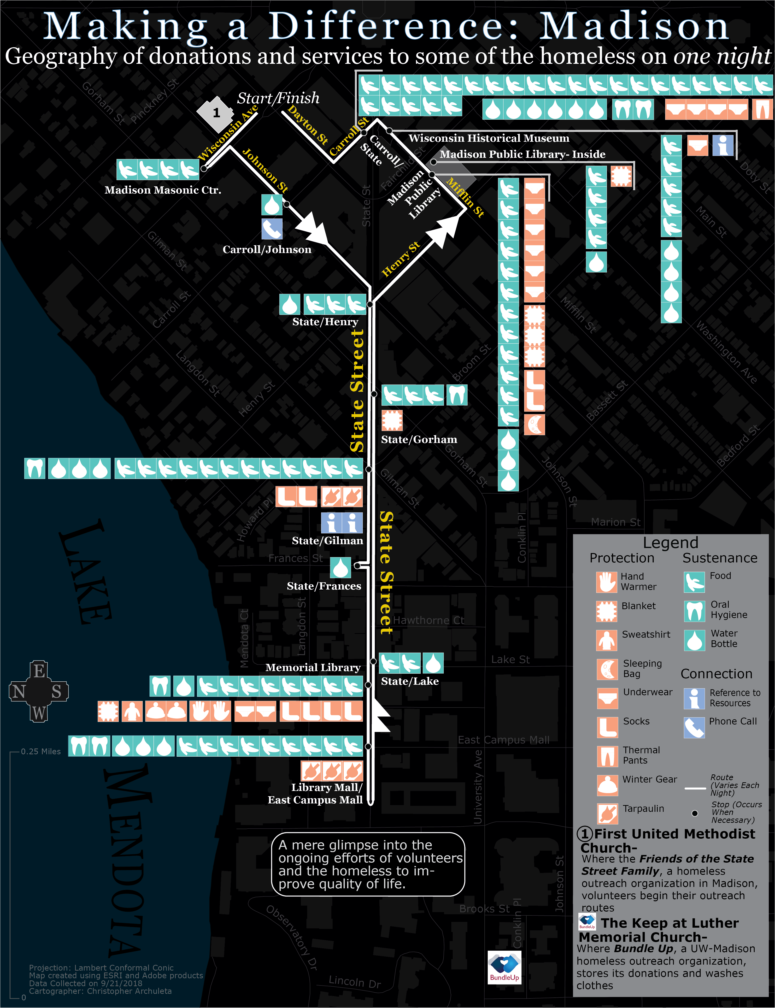
This map is a slight revision of my final project for the Introduction to Cartography course at UW-Madison. Robert Roth taught the course when I took it in Fall 2018. Some key concepts in the course were the synergies of visual variables, the importance of generalization for presentation, the appropriate uses of different thematic maps, and the appropriate uses of projections.
Background
In December 2017, I joined Bundle Up, a UW-Madison student organization, as a homeless outreach volunteer. After several months with Bundle Up, I decided that talking with Madison’s unhoused community and personally helping them was my favorite outreach component. So I joined Friends of the State Street Family (FSSF) in September 2018 as an outreach volunteer. FSSF is a homeless outreach organization based in Madison, WI that offers donations, housing assistance, employment information, advocacy, and social support.
A couple of months after joining FSSF, while also continuing my service in Bundle Up, Roth’s introductory cartography class began their final projects. For the final, students were expected to create a map, typically in the form of a print map. As a student, I had to produce a map that showed my understanding of the basic cartographic design principles. During the course, I acquainted myself with the process of data acquisition and learned tools such as ArcMap, Adobe Illustrator, and MapShaper. In the event that I deviated from the cartographic norms presented to us in the course, I was expected to defend my design choices, which is an important skill to have. Rob encouraged his students to work on a personally meaningful project, so I decided to make a map that connected to my work with the homeless. Mobilizing unpaid volunteers to help hundreds of people on a daily basis isn’t easy, so I wanted to create a map that conveyed the magnitude of that mobilization. There are multiple ways to do this, but I decided to map the volunteering component that I was most familiar with, the in-person outreach.
Data Collection
A typical day’ outreach with Bundle Up or FSSF covers a route similar to other days. Therefore, I took the liberty of using data from a single day as a proxy for an average of all days. I recorded the outcomes of all interactions of the September 21, 2018 FSSF outreach. I only took data from one day because logging the donations reduced my ability to actually help with the volunteering. My data was basic, consisting of the content, quantity, and location of a donation. I knew from experience that the spatial component of outreach was important because there are known hot spots where there are more people and more donations given. This first-hand data collection is what sets this map apart from my other ones, which are made from amalgamations and modifications of pre existing datasets and maps.
Design Process
Initially, I knew that the donation locations, donation types, and the donation sizes were going to occupy the top of the visual hierarchy. Prospective members of Bundle Up or FSSF, my target audience, would be able to grasp the scope and magnitude of a single outreach with a glimpse. Then, with more focused reading, the reader would first see the different kinds of donations and services. The vicinity of the donation route, with its respective labels, would recede to ground. I also decided in the first iteration that the map would take a dark theme to mimic the night time conditions that winter outreaches take place in.
Roth looked at a quick draft I made of my first idea. Since I wanted to focus on the numeracy, Roth suggested that I symbolize donations with a one-for-one method. Instead of multiplying the icon of a given donation to symbolize quantity as I did in the draft, I would make one icon for each donated object. This tactic does a better job of overwhelming the reader. As for the icons themselves, Rob gave me some lecture notes and referred me to some literature. This was my first exposure to icon construction, so Roth walked me through standard concepts such as sizing, silhouettes, and simplicity. The last main change to my map was the orientation from north-up to east-up. This made the largely east-west donation route a vertical axis on the map, acting as a sort of spine from which the donation icons would grow from on Letter size paper.
In the later iterations of the map, I saved the hues for symbolizing the icons. That’s because, on top of the specific donation, I wanted to group donations into three categories, with a particular hue corresponding to a particular category. Metro maps inspired me to use a nodal symbol for the donation locations, which I placed on a bold white line that symbolized the route. Though I collected the data on a FSSF outreach, I included the BundleUp storage site location on the map to reinforce its presence to student readers.
I got most of the basemap data from OpenStreetMap via Geofabrik and projected it in ArcMap, generalized it in Illustrator, and stylized it in Illustrator.
Future
BundleUp showcased this map at three student org fairs and at the Spring 2019 kickoff meeting. It illustrated the importance of in-person outreach to prospective and new members. I will propose to FSSF to use this map for funding purposes. Many of the donations come from freely given items, but they’re often insufficient to cover all the needs of the homeless. So, outreach organizations often purchase items to have a comprehensive reserve of donations. A FSSF version of the map would have a different extent to focus more on the donation route and less on the UW campus. In any case, future iterations of the map will declutter the icons near the top for aesthetic and comprehension purposes.
