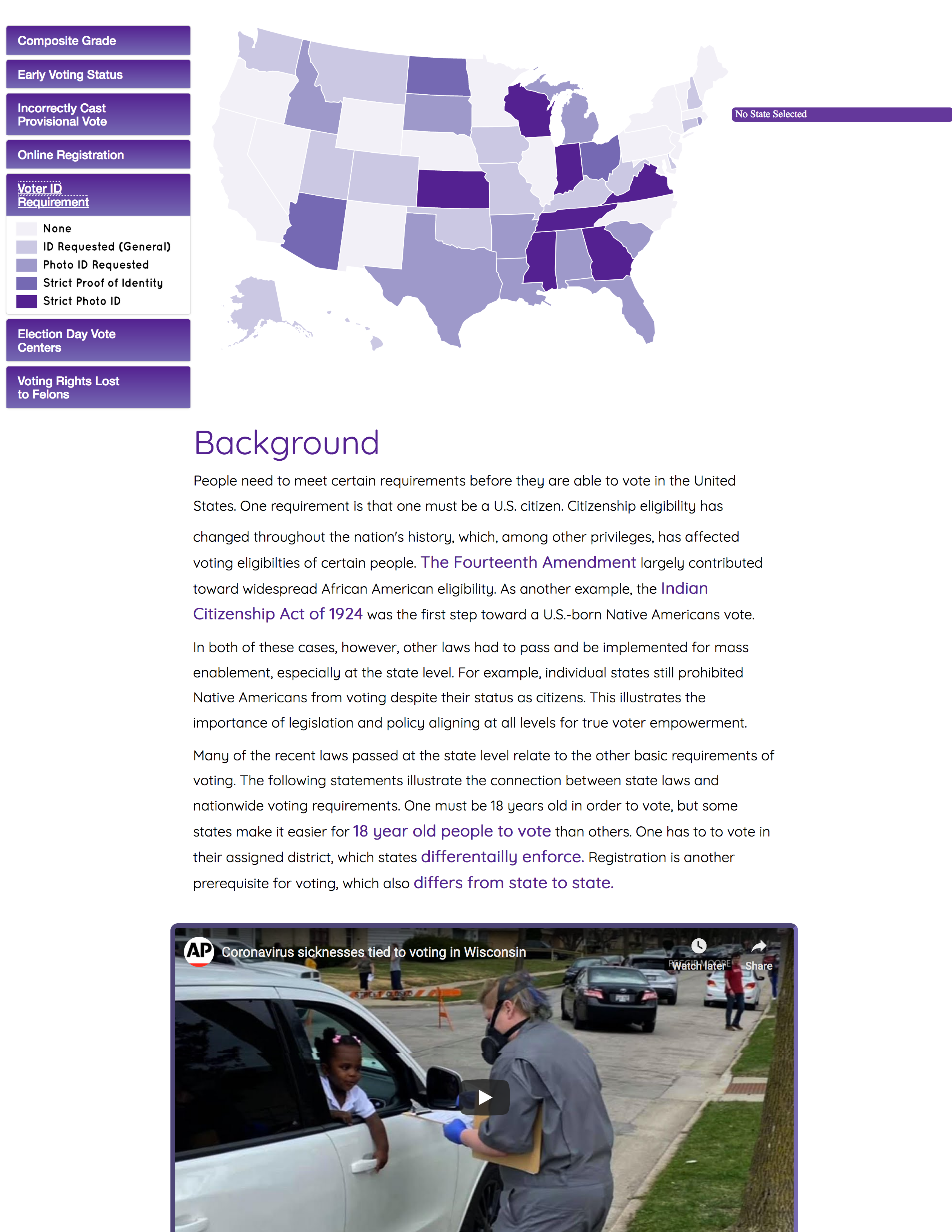
This map originated as my final project for the Interactive Cartography & Geovisualization course at UW-Madison in Spring 2020. The final project for this course, taught by Robert Roth, is typically completed by a small group. In my case, I collaborated with Michael Biehl and Regan Murray for the final project.
Background
This course began as an introduction to UX theory with a simultaneous introduction to coding in JavaScript. In this early stage, the class content focused on when one should make a map interactive, breaking down the interaction process, and connecting user objectives to corresponding interface operators and operands. At the same time, lab assignments consisted of basic coding practices, an introduction to Leaflet, and an introduction to D3. Eventually, the two parts of the class worked in tandem as the lecture topics transitioned to styling and usability.
Process
Once the lecture and lab components of the class began to merge, students had to group together to create an interactive map, starting with a use case scenario and an example user. Regan spearheaded the project with a choice of either mapping disenfranchisement of Alaskan natives or mapping voter suppression in the U.S. After joining her, Michael and I opted for her latter proposal.
We initially had trouble deciding what we actually wanted to create concerning our topic. One important development in our process was the shift from the city-focused maps that I proposed to a national map. Though we all argued that a national map comparing the states’ voting laws would be part of the project, my idea to look at individual cities was too anecdotal. Likewise, Michael planned to map voter turnout but we instead chose to describe voter turnout and related laws in text and video. This avoided a larger workload and an arguably misleading enumeration of data at the state scale.
Eventually, we had to refine our persona and use case scenario. We expected our users to be somewhat familiar with online maps and be interested in how voting laws differ by location. Our hypothetical persona fit into this category, having been a government official who wanted to compare her state’s voting laws to those of other states. Her goal of voters’ rights advocacy would benefit from the site since she could see which laws contributed to the strictness of different states. The persona would mainly compare her state with other states in our use case scenario. With each reexpression, she could see specifically how her state was stricter in some laws and less strict in others. To get information on each of the laws explored in the map, she would quickly look through the text below. Doing so would clarify how the variations of each law translated to relative ease of voting.
Roth suggested that we should use Your Body (Not) Your Choice by Katie Kowalsky, Dylan Moriarty, and Robin Tolochko as a template for our map. Their setup worked well for our project because the user could see the geographies of different laws as well as a composite map. Most of the data came from the National Conference of State Legislatures. They made U.S. maps for most of the laws that they studied on their website. Regan assigned numerical values for the strictness of a given law, and gave each state a letter grade based on the sum of its laws’ values. The map itself was an equal-area choropleth map, with values corresponding to the strictness of a given law. The map’s interactive features were not created primarily for mobile devices, but much of the interface is responsive and most of the interactivity applies to mobile devices. For interactivity, we implemented highlighting for hovering, reexpression for each law, and retrieval of a state’s profile. Hovering over a state summoned its profile, which showed that state’s strictness for all of the laws assessed in the map.
We also created a complementary website with text, videos, and links. When the page loaded, the user saw the title, a brief introduction, and the map. We created legends for each reexpression of the map and put them in collapsible panels. We made the legend panel the mode of reexpression. For example, the map recolors depending on which legend is expanded. If a user wants to see a particular version of the map, they need to click on the correspodning legend panel.
