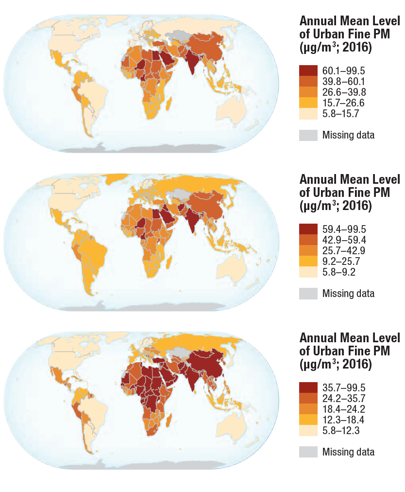
These are a few of the illustrations that I worked on for a book called Mapping for a Sustainable World, which was jointly published by the UN and the International Cartographic Association (ICA).
The Book
The authors of Mapping for a Sustainable World wanted to demonstrate the usefulness of maps for communicating patterns in real-world data that are otherwise difficult to recognize.
Mapping for a Sustainable World uses UN Sustainable Development Goal (SDG) data. The 2030 Agenda for Sustainable Development was introduced in 2015 to encourage the world’s countries to improve the state of the world. In order to define and gauge this improvement, or “sustainable development”, the UN created 17 SDGs. The Agenda describes the process of SDG creation as follows:
The Goals and targets are the result of over two years of intensive public consultation and engagement with civil society and other stakeholders around the world, which paid particular attention to the voices of the poorest and most vulnerable. This consultation included valuable work done by the General Assembly Open Working Group on Sustainable Development Goals and by the United Nations, whose Secretary-General provided a synthesis report in December 2014.
The UN proceeded to gather data from many of the world’s countries to measure their progress in achieving these goals. Mapping for a Sustainable World depicts this data in a myriad of ways to make the case for good cartographic practices. To do this, the book covers topics typically explored in a cartography class, such as design principles, map types, and user considerations.
Map readers and map makers alike should be familiar with the nature and origin of the data that they’re presented with. The book does this in the first section by explaining what SDGs are and presents them in the context of crucial topics such as normalization.
Thus, the book is both a unique presentation of UN SDGs and a unique introduction to cartography.
My Contribution
In the summer of 2019, Robert Roth, my professor at the time, who is also the academic director of the University of Wisconsin Cartography Lab, offered me a wonderful opportunity.
He told me that he was one of the authors of an upcoming book that the UN and ICA would publish together, and that I could contribute as a student cartographer working for the Lab. I will always be thankful that I was given the chance to contribute to a UN and ICA publication. I was tasked with examining and categorizing the data. I also looked for data errors and anomalies, and made recommendations for potential maps. Then I drafted several maps, which typically followed design specifications that helped to establish the style of the book.
During the process, I learned that my preconceived notion of data was unrealistic. While I expected some of the uncertainty in the data, such as the loss of accuracy from acquiring data on a national scale, I was admittedly surprised by how many blatant errors and nonexistent entries I found.
This was also my first direct exposure to the politics of cartography. People who were working on the project brought up several nuanced issues that nonexperts would probably overlook. These issues pertained to things like semantics, toponymy, and geographical representation.
For More Information
I encourage you to explore the links on this page to learn more about the project! Click here or on the book title in the introduction to navigate to the online version of Mapping for a Sustainable World.
